The Cameo Camper Renovation: New Exterior Logo
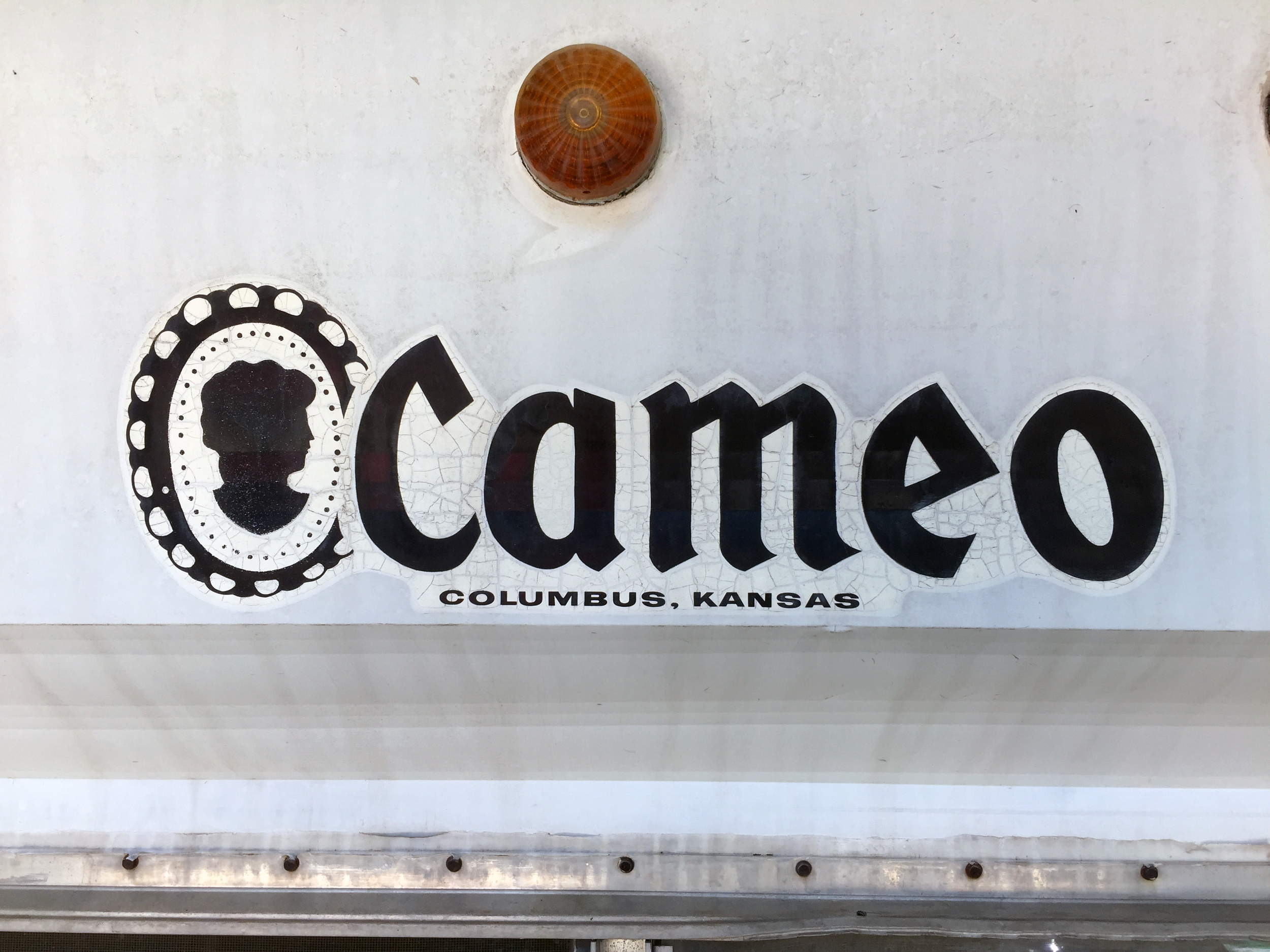
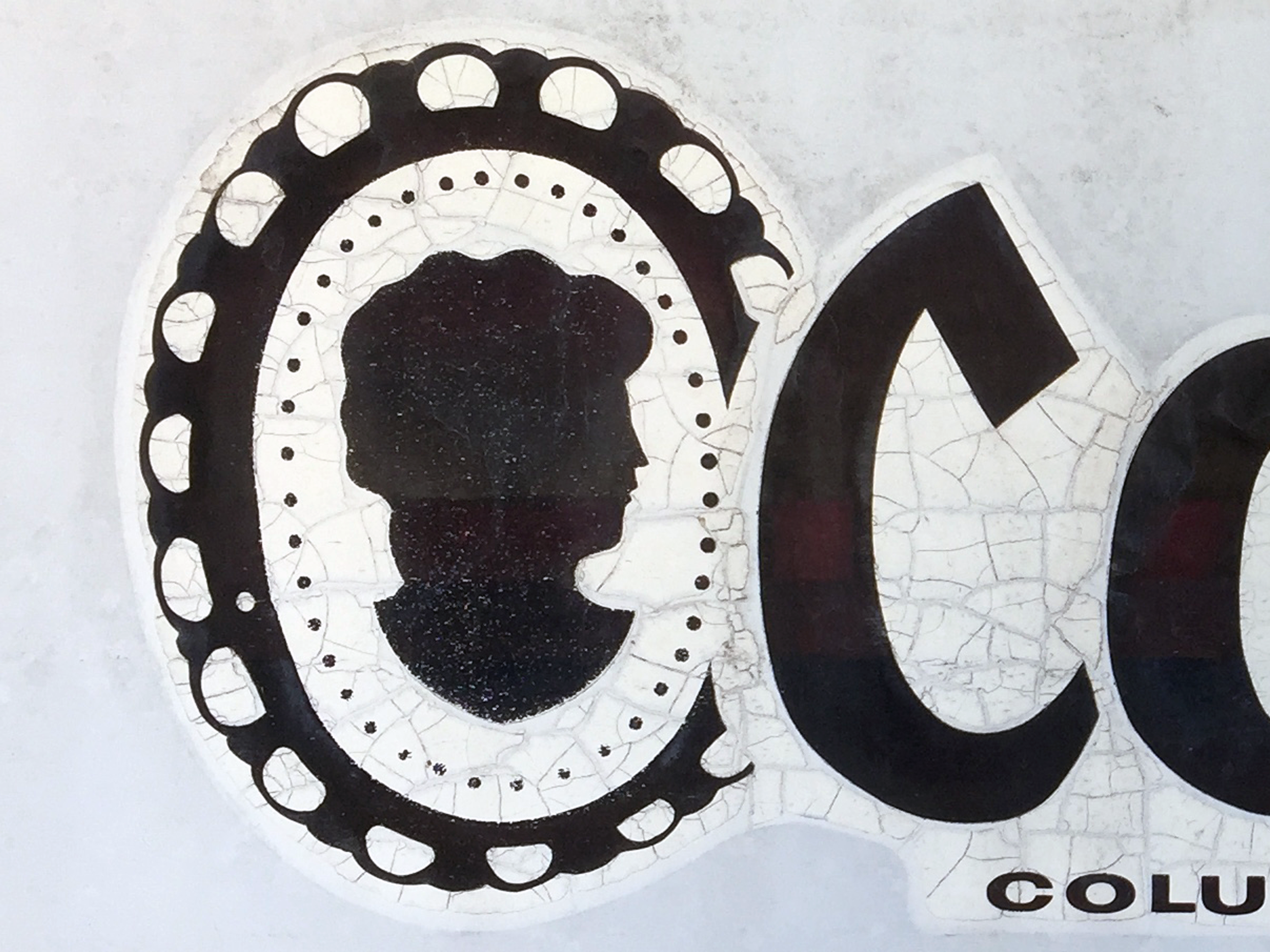
Years ago, toward the beginning of our renovation, we removed the original 50-year-old crusty cracking logos on the front and back of the camper so we could prep and paint the exterior. Before we scraped then off, I took photos of the original logo to recreate it later.
Well folks, it’s finally later and I’m so excited to share how well it turned out – complete with a logo download for anyone who needs it (at the bottom of the post)!
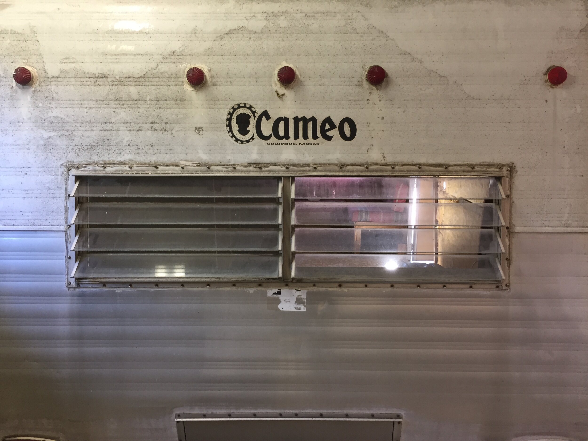
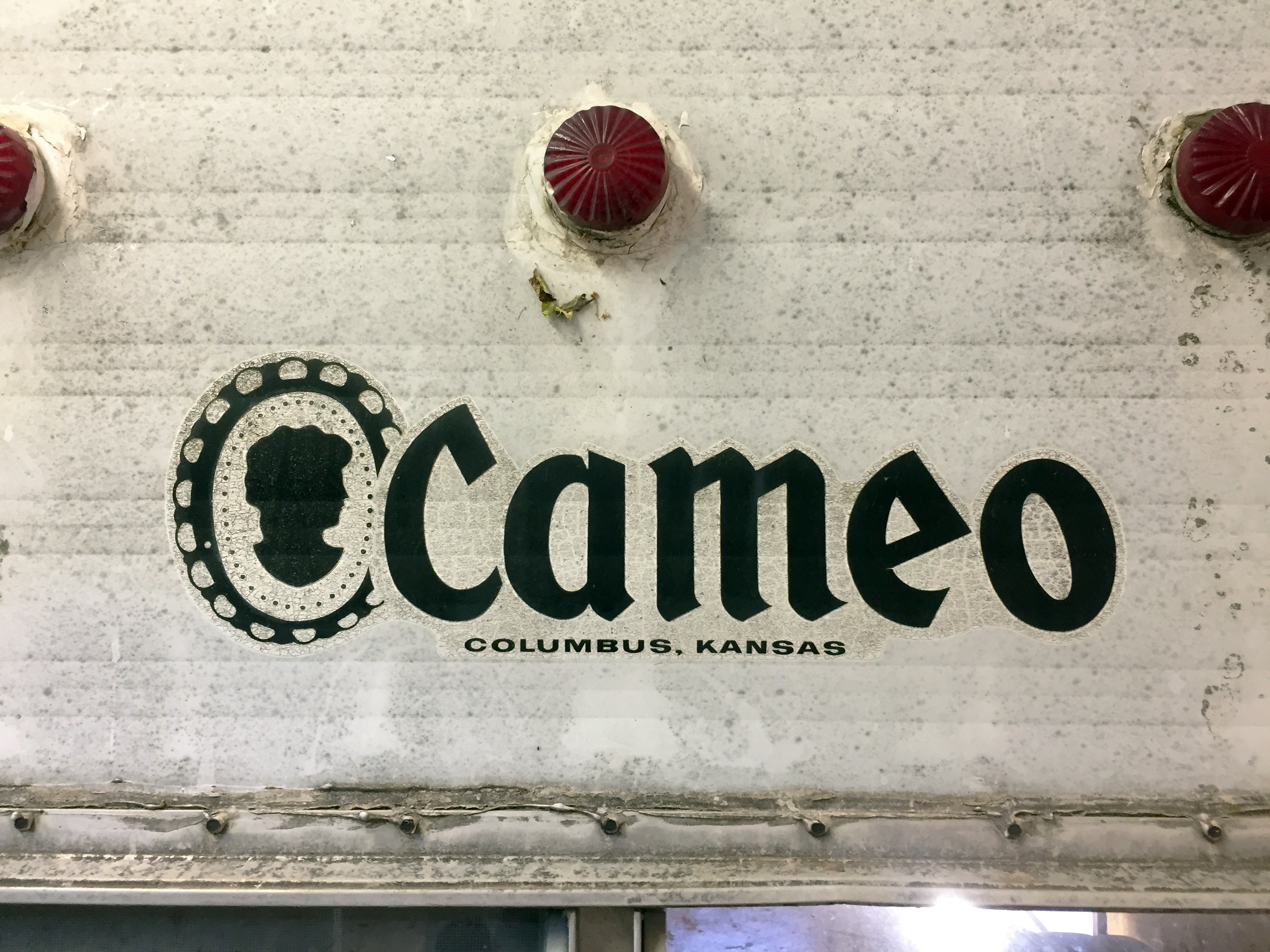
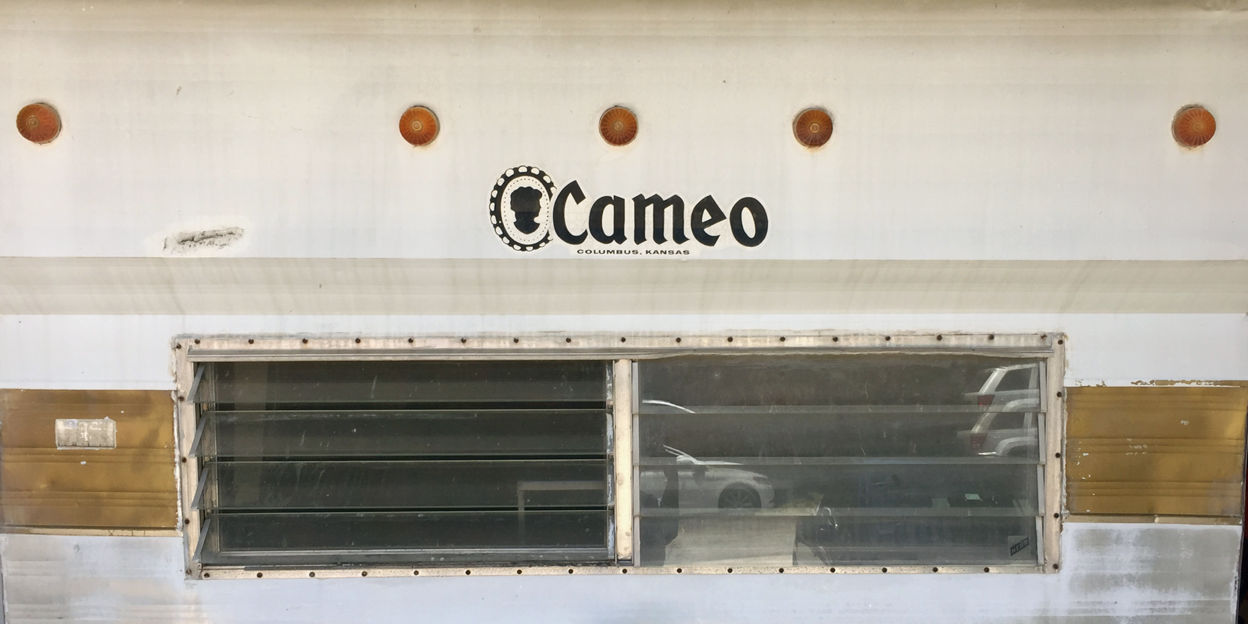
Here’s how the logos on the back and front looked before:
(You can tell which is which because the back of the camper has red clearance lights, while the front has yellow.)
You can see in the before photos above, the original logos were made of one white sticker with a black logo printed on it.
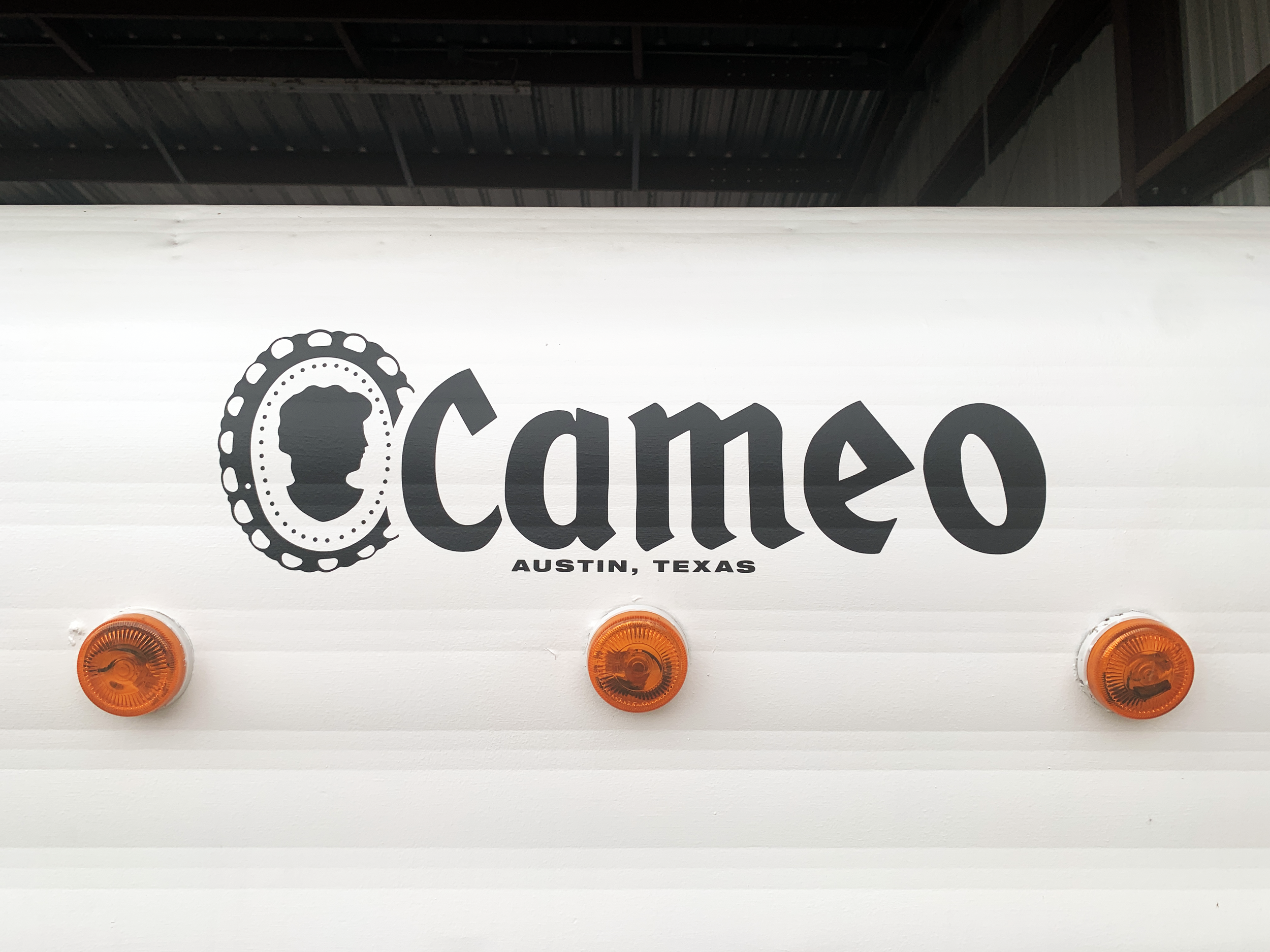
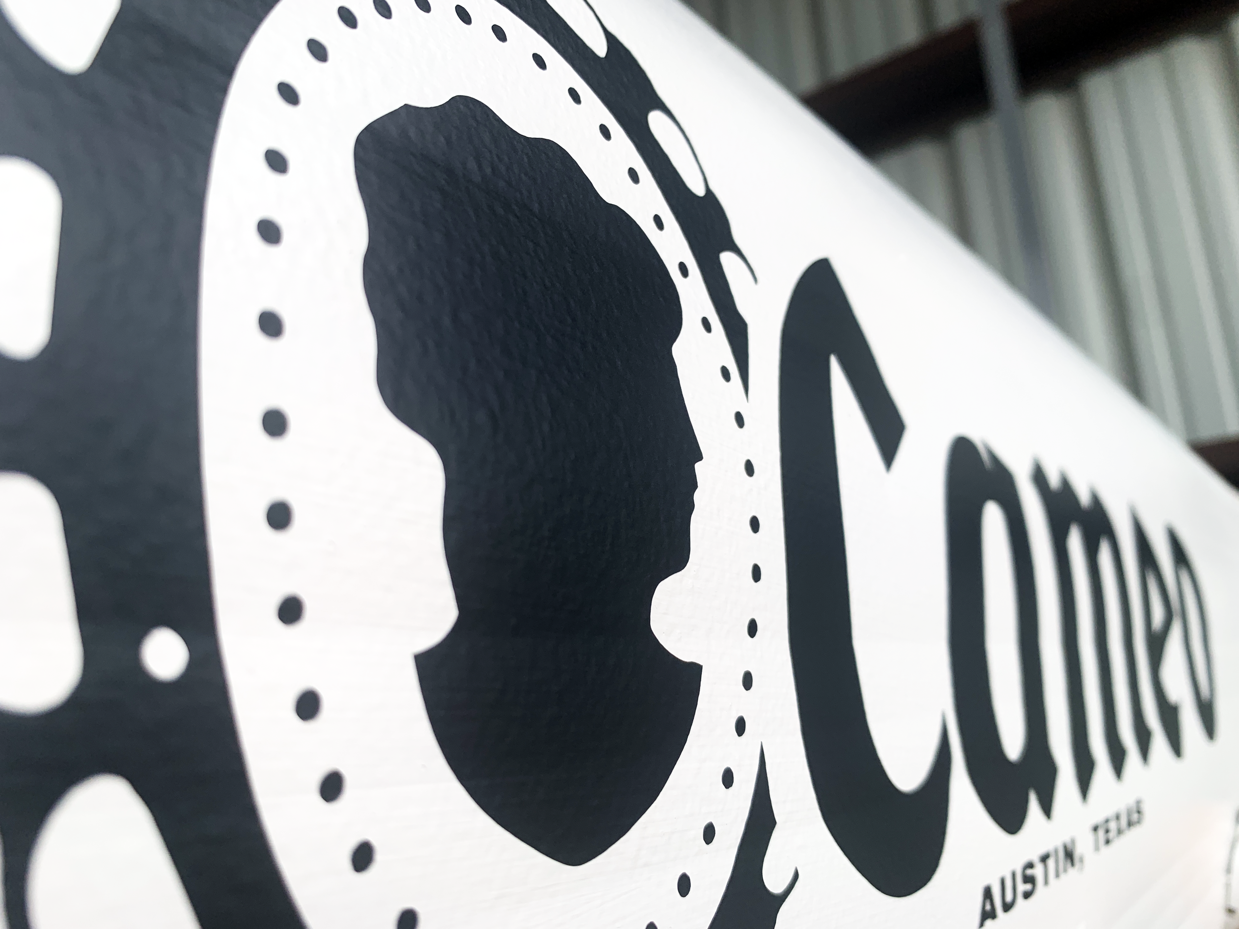
…And how the front logo looks now:
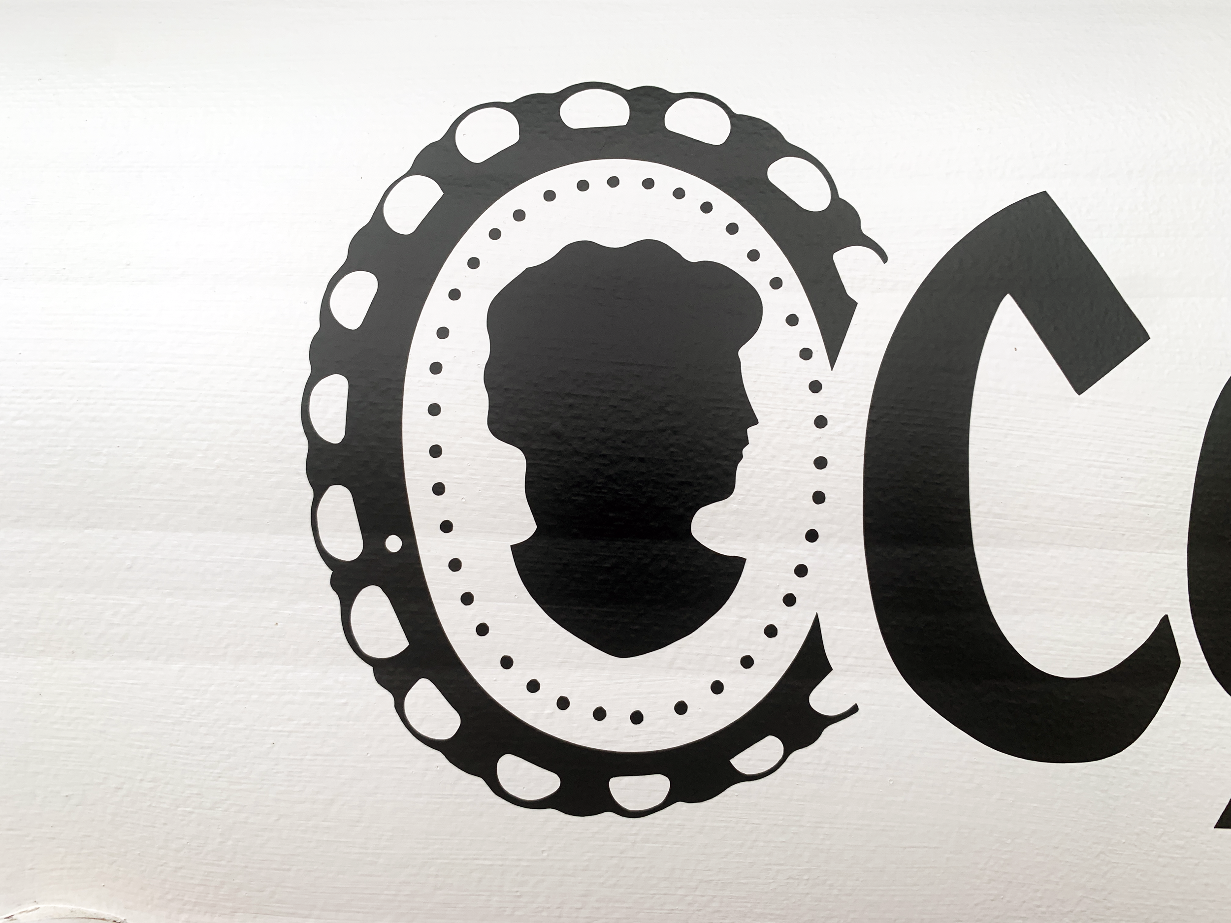
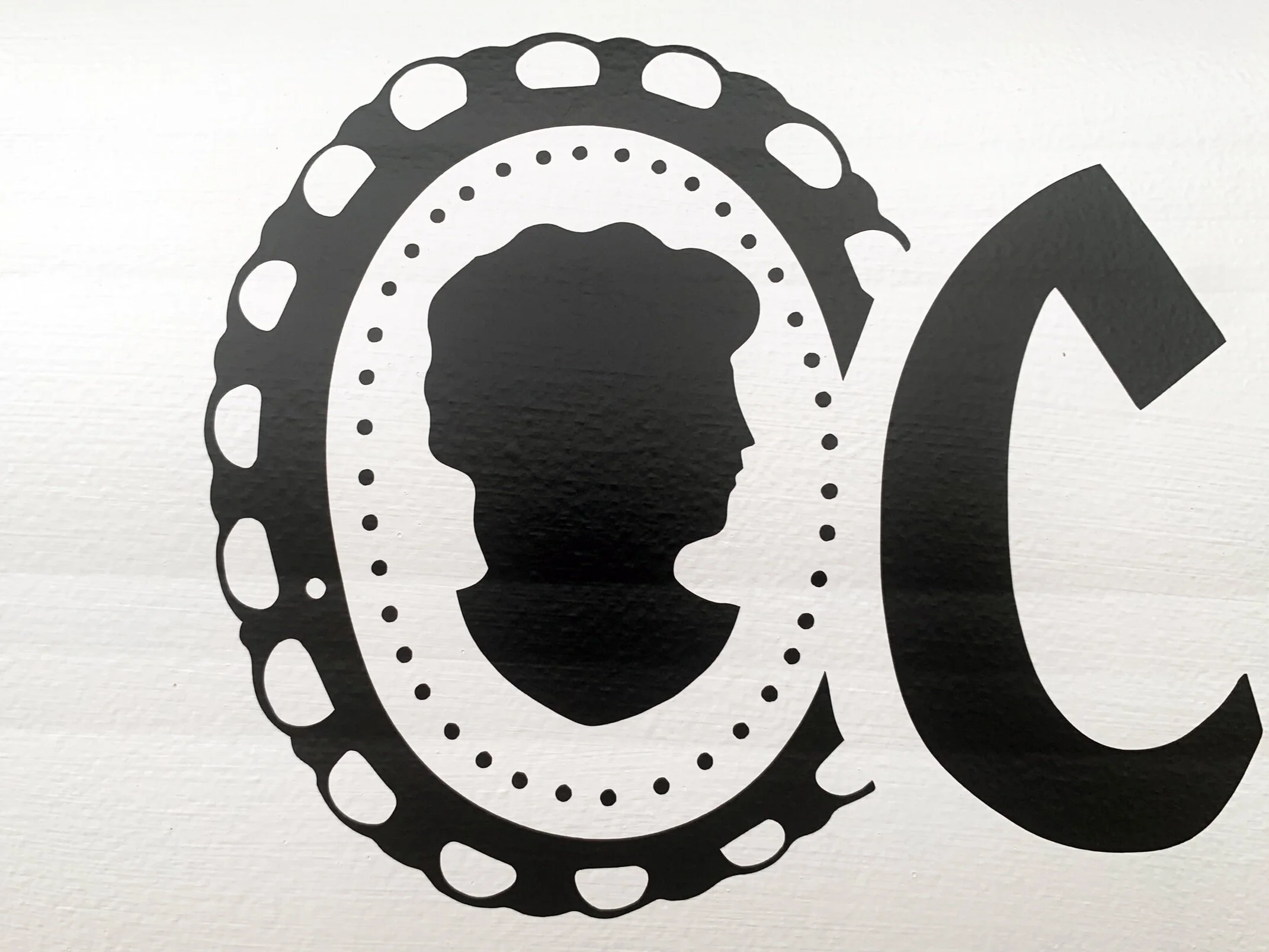
Now, the logos are made of black die cut vinyl, meaning they have no background. Each speck of black logo you see is its own piece of vinyl so there’s no white sticker background on top of the off white paint. You can see in the detail photo above how thin and pliable the vinyl is, that you can see the subtle paint texture through it, which helps is look like it’s very cleanly painted on, instead of a decal.
Removing the old logo
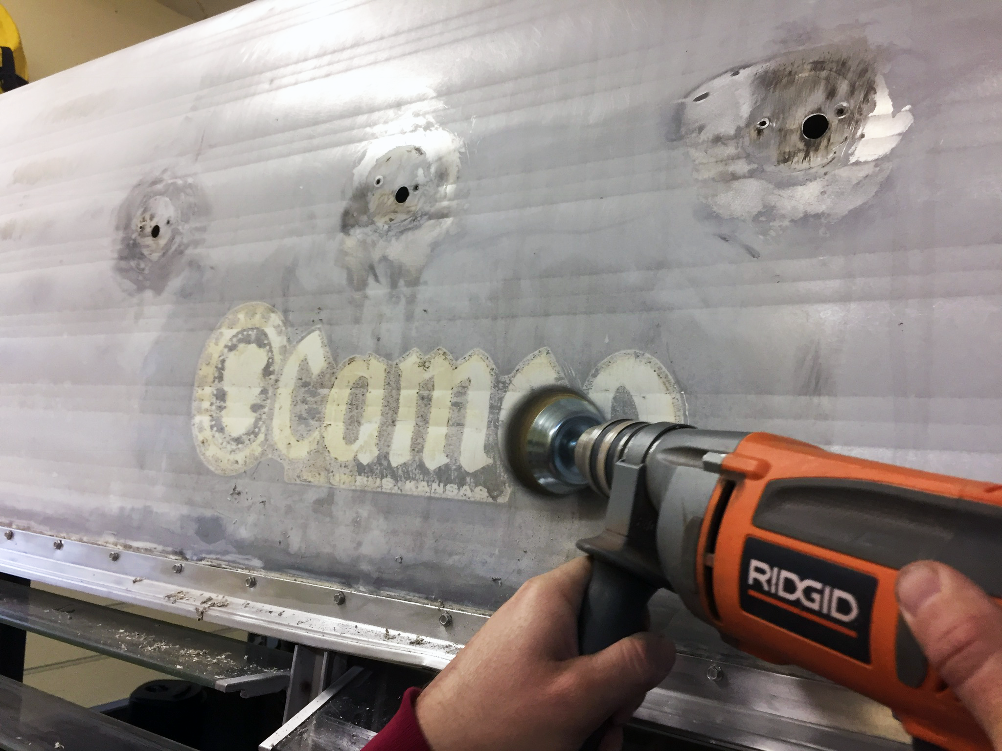
We started out by using a flat razor to remove the old sticker logo. It came off pretty well (and better on the back), but needed some extra help to remove the white sticker outline/background, so Nick used a corded drill with a wire wheel to remove anything left by the logo.
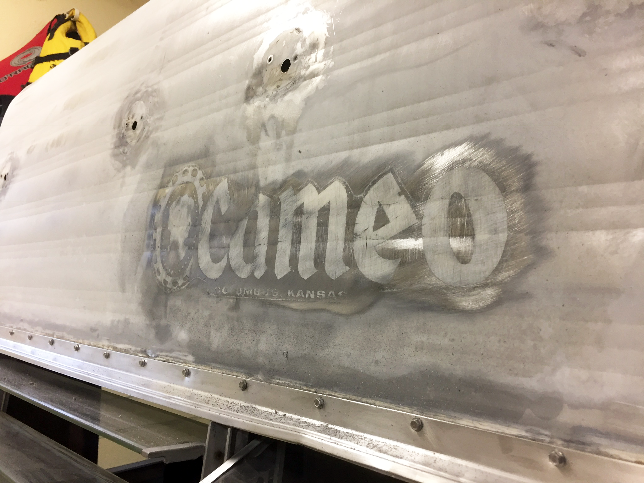
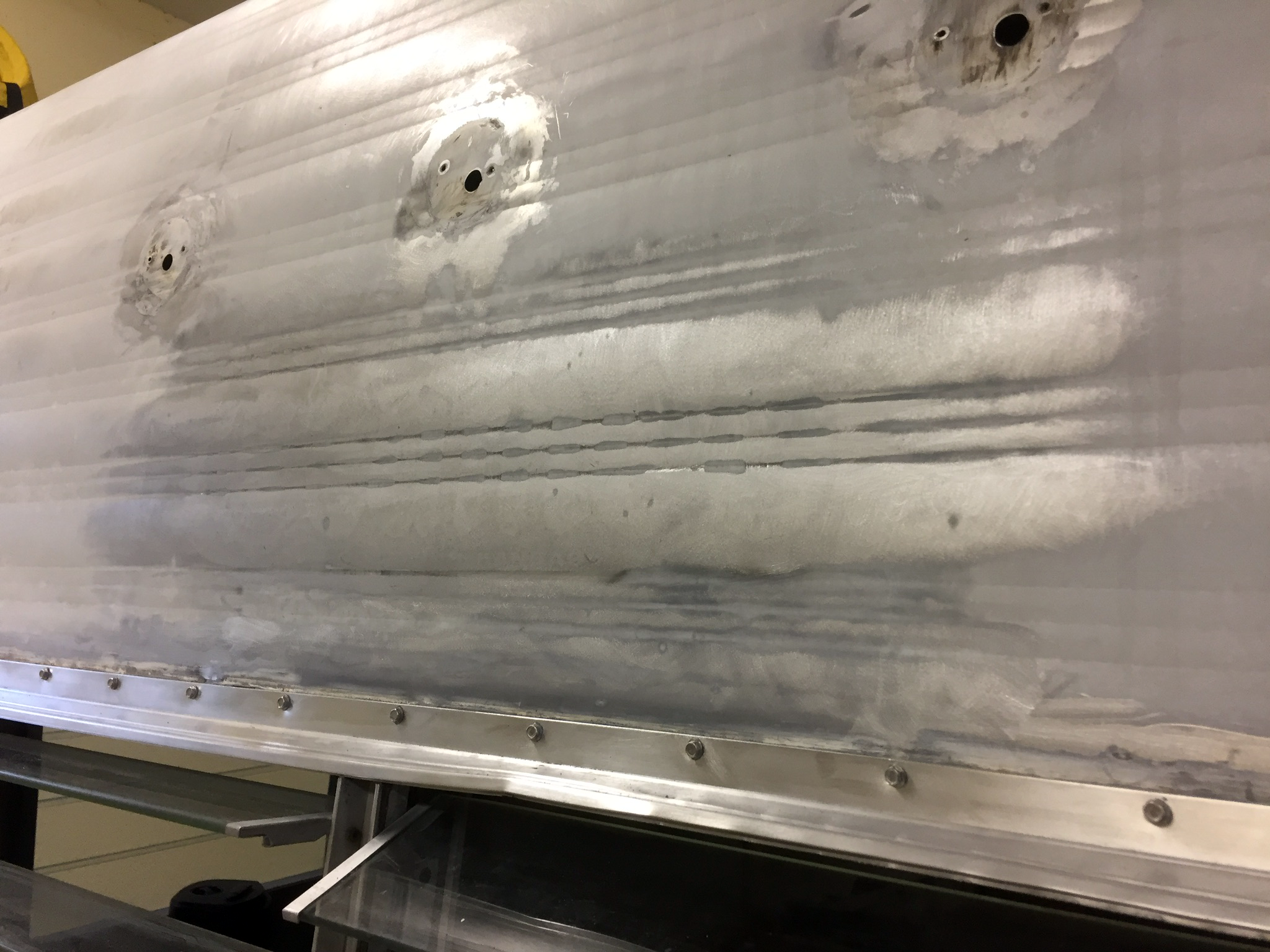
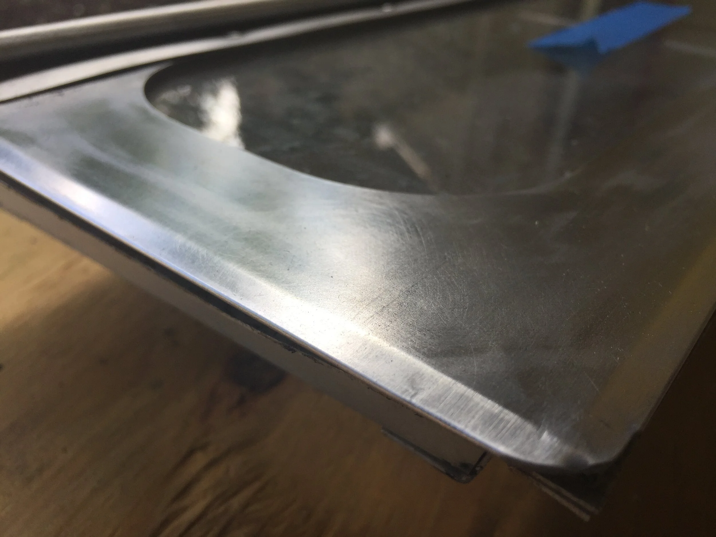
You can see even after removing it all with the wheel the ghosting that was left on the skins, until I went over the areas with an orbital sander and fine grit sand paper. After sanding and cleaning with TSP, these areas primed and painted nicely when we applied our exterior paint.
I do think the ghosted logo is kind of beautiful, though:
Recreating the logo
Since the beginning, we’ve gone back and forth on if we wanted to create a new just-for-us Cameo logo, come up with a name for our camper and have a logo of it, or if we wanted to keep the OG logo.
After playing around with some different late 60’s-inspired looks to see if anything felt “right”, we finally landed on recreating the original logo as-is, flaws, asymmetries and all – with just one minor edit. Instead of keeping Columbus, Kansas (the location of manufacture) along the bottom, we decided we wanted to impart a little something from her time with us and swapped it out for Austin, Texas.
Using one of our close-up photos of the logo, I used the pen tool in Adobe Illustrator to draw on top of it and swapped the city and state for ours using the same typeface as the original logo. Then I got the design file to my cousin, who cut it out using her vinyl cutter {like a Cricut or Silhouette Cameo – (ha!) – machine} and black vinyl.
The original and recreated logos are both 6” tall (from the top of the lace cameo oval frame to the bottom of it) and 19.8336” wide.
Installing the new logo
First, we dusted the cobwebs off of the camper exterior with a dry rag and followed with a Clorox wipe to remove any remaining oil and dirt. (We thought about using paint thinner like we use with many other projects, but we didn’t want to accidentally weaken the exterior paint or leave a weird, dull, textured spot.)
After the metal was dry, we peeled the backing off of the logo, gently placed the logo in place and stepped back to look at it from afar before really burnishing it down with a credit card.
Really, we probably should’ve measured and lightly marked out the exact center of the camper and the exact center of the logo (on the top, bottom and edges of the clear vinyl layer) to line it all up and make sure it was parallel to the camper, but I decided to just go for it and eyeballed the whole thing using the yellow clearance lights to center it from left to right and the horizontal line pattern in our metal wall skin to act as a level baseline. (It also helps that “Austin” and “Texas” are both relatively the same length, so the comma more or less is centered over the middle clearance light.)
Out of curiosity, Nick checked my placement (on what he calls my “picture hanging eyes”, as I have a tendency to just wing these kind of things) and we happily and surprisingly found our front logo was dead center, with 32” on either side of the decal to the edges of the camper.
(Pats self on the back.)
To stick it down and smooth it out, I worked from the middle of each letter/vinyl shape and smoothed it out to the edge with a credit card, making sure to work out any air bubbles. When each black vinyl piece looked firmly stuck to the camper, I carefully peeled back the clear top piece of (I think) vinyl that helps keep the whole design together at a steep angle so as not to pull the black vinyl decal straight out and off of the camper skin.
What about the logo on the back?
Great question.
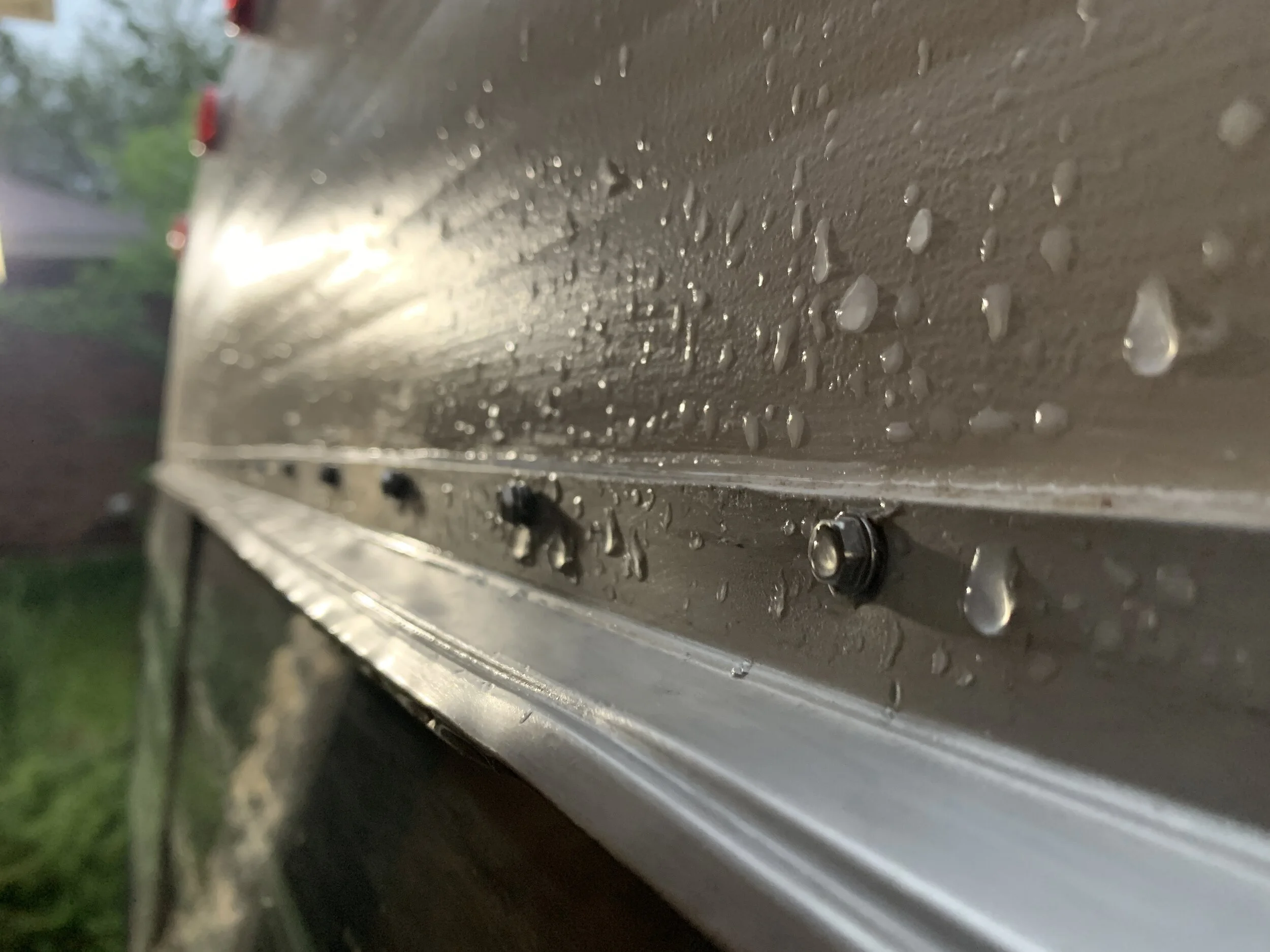
We haven’t done the back quite yet, because we got back there to do it and noticed we have some slight grayish-tinted discolored drips on the paint (we think from sap or rain rolling off of a dirty pollen-covered roof or something) that we want to paint over just to make sure it looks perfect and so we don’t have to cut in paint around the logo, which would be just asking for a disaster.
We’ll likely follow the same process for the back as we did the front … heck, we might even get squirrelly and measure it out!
>> Get your vintage Cameo logo here <<
(The above link will take you to our shop where you can buy a .zip file containing .eps, .jpg, .pdf, .png and .svg file types.)
If you’re one of the lucky others out there that are also renovating a vintage Cameo Travel Trailer (or you just like vintage logos), we’ve started selling the original (read: the Columbus, Kansas version) logo in our online store for you to make your own vintage replacement.
And lastly…
A good old fashioned before and after
So you probably also noticed that our logo is now above the clearance lights and before it was below. This is partly because I stuck it without first checking my before photo, and partly because we thought it would look nicer and less cramped up there.
What do you think of the new vintage logo? Would you have updated it entirely or given The Cameo a name and made that the logo instead? How have you put your logo back on your camper? We’d love to hear from you in the comments below.
